Case Study
ACpms — Hotel Management System
A web-based management platform designed to help hotel staff organize daily operations, manage bookings, and respond to guests faster.
Overview
ACpms is a web-based hotel management system built to support fast-paced front desk and operations teams. The platform helps staff track check-ins/check-outs, manage bookings, handle guest requests, and monitor operational issues such as unpaid bills or failed door unlock attempts. The main focus of this project was designing a clear, scalable interface that makes complex data easy to scan and act on quickly.
The Challenge
Hotels deal with a high volume of data and constant context switching, especially at the front desk. The main challenge was presenting complex information without overwhelming the user.
Key challenges
- Large amounts of operational data needed to be visible at a glance
- Staff must complete actions quickly while multitasking during busy shifts
- Screens required strong hierarchy to prevent mistakes in high-pressure situations
Goals
- Make critical daily tasks easy to find and execute in seconds
- Reduce friction in core flows (bookings, check-in/out, guest management)
- Build a layout that stays readable with dense data (tables, calendars, statuses)
- Create consistent UI patterns that support new features without redesigning everything
- Provide clear system feedback (success/error states, statuses, alerts)
User Flow & Structure
The initial structure created during first meetings with the client. This was done in FigJam. During the design process and multiple iterations, parts of the architecture changed.

Iterations
Early wireframes focused on layout clarity for dense information and consistent spacing between data groups.
What I explored
- Card-based dashboard layout for agenda + alerts
- Calendar timeline layout for room status clarity
- Table-based booking view with filtering and quick actions
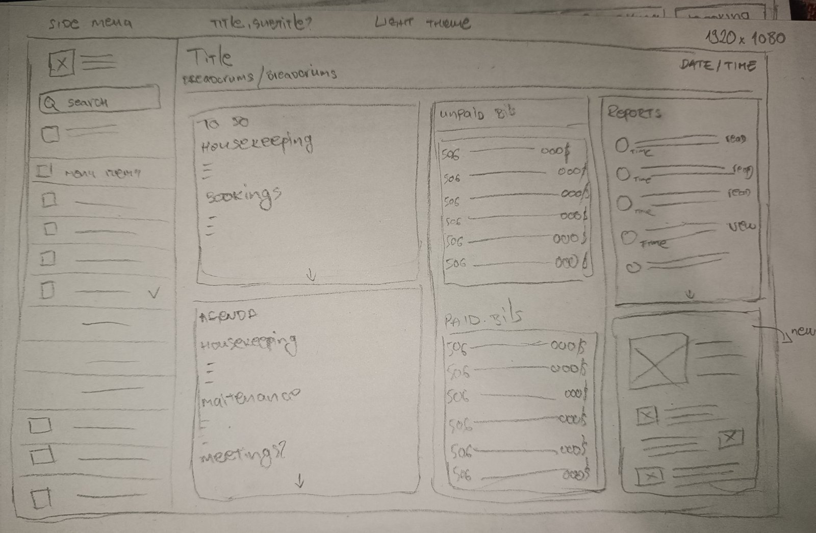
Iteration improvements
- Improved hierarchy with stronger section headers and alignment
- Reduced visual noise by grouping related actions
- Increased readability with consistent spacing and row structure
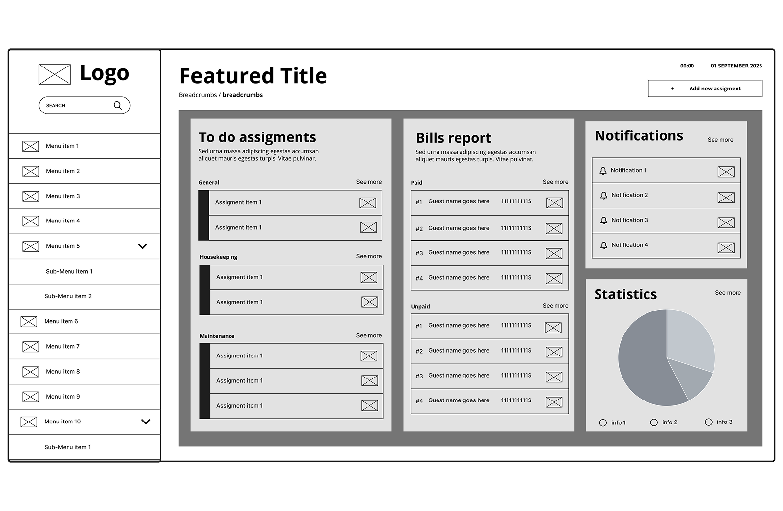
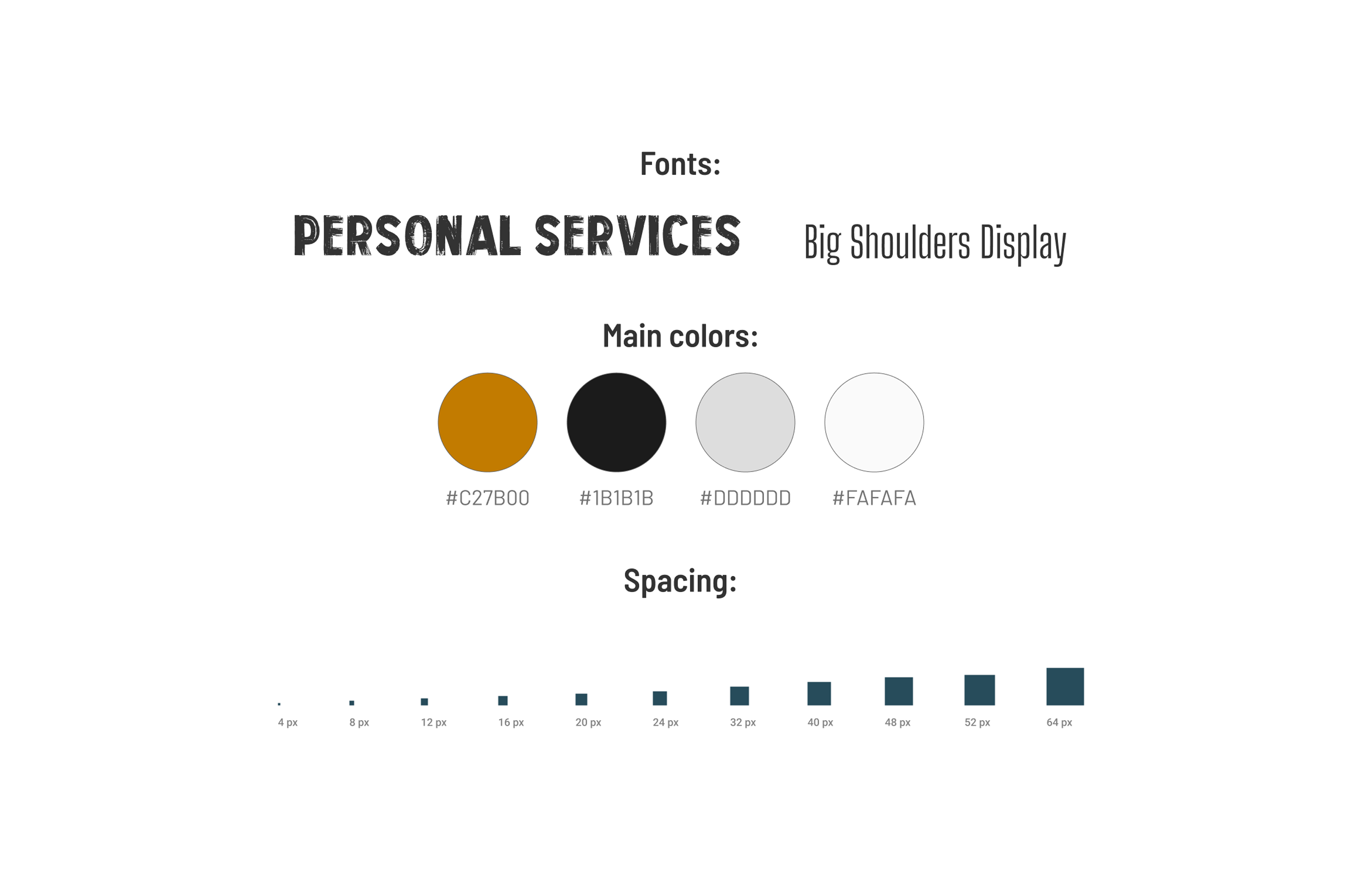
UI Decisions
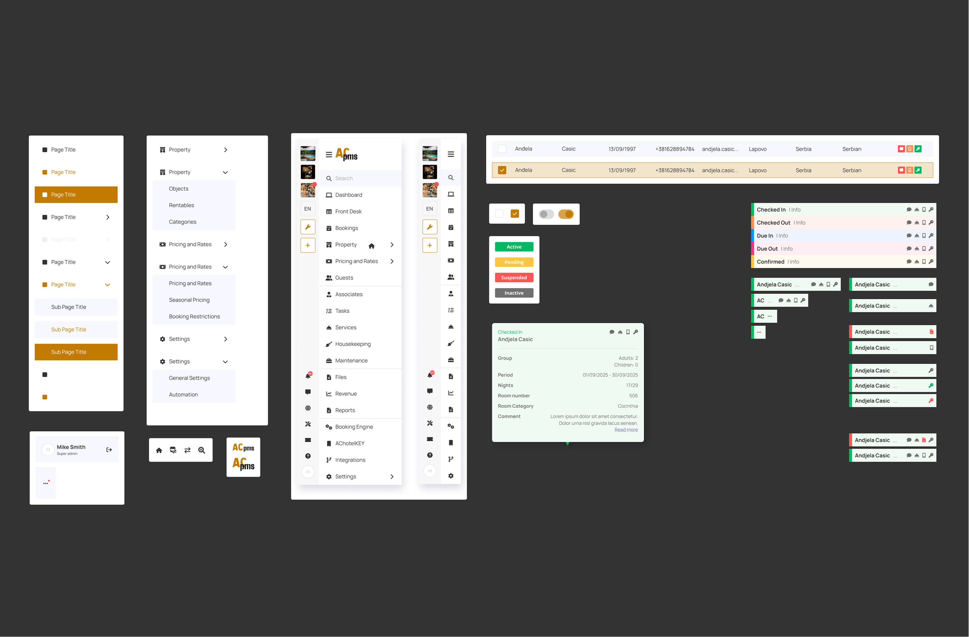
A reusable component system ensured the UI stayed scalable as new features were added.
Design decisions
- Clear typography scale for dense screens (tables, dashboards, forms)
- Consistent spacing rules (card padding, row height, grid structure)
- Semantic colors for statuses (success / warning / error)
- Reusable components for frequent actions
Components included
- Data tables with actions
- Status chips and dropdown states
- Card modules for dashboard content
- Chat UI patterns + message states
- Calendar/timeline blocks for stay statuses
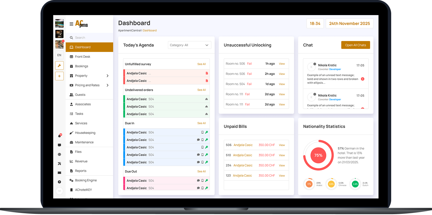
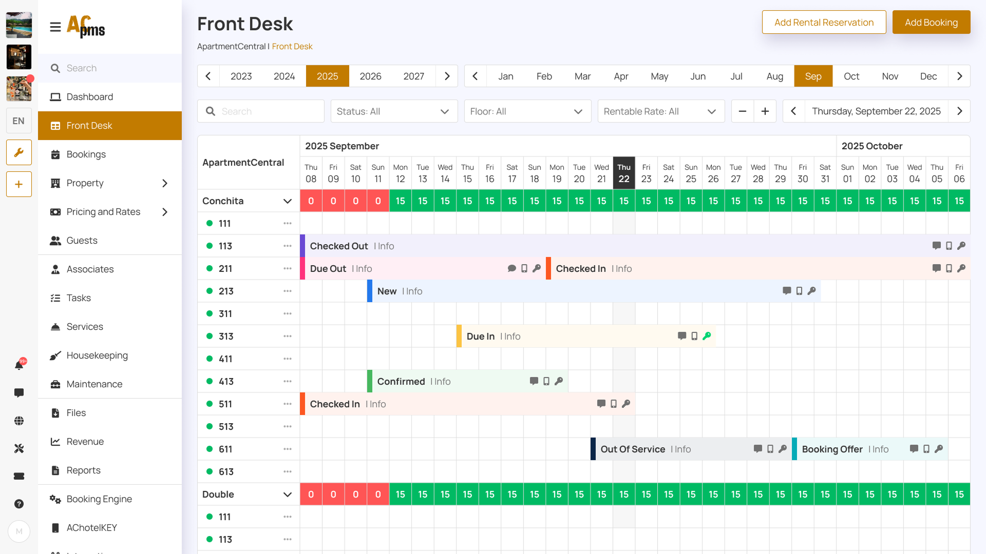
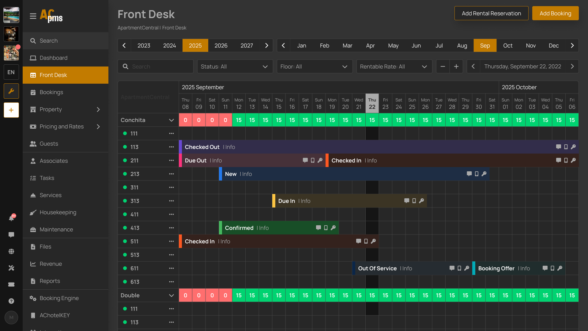
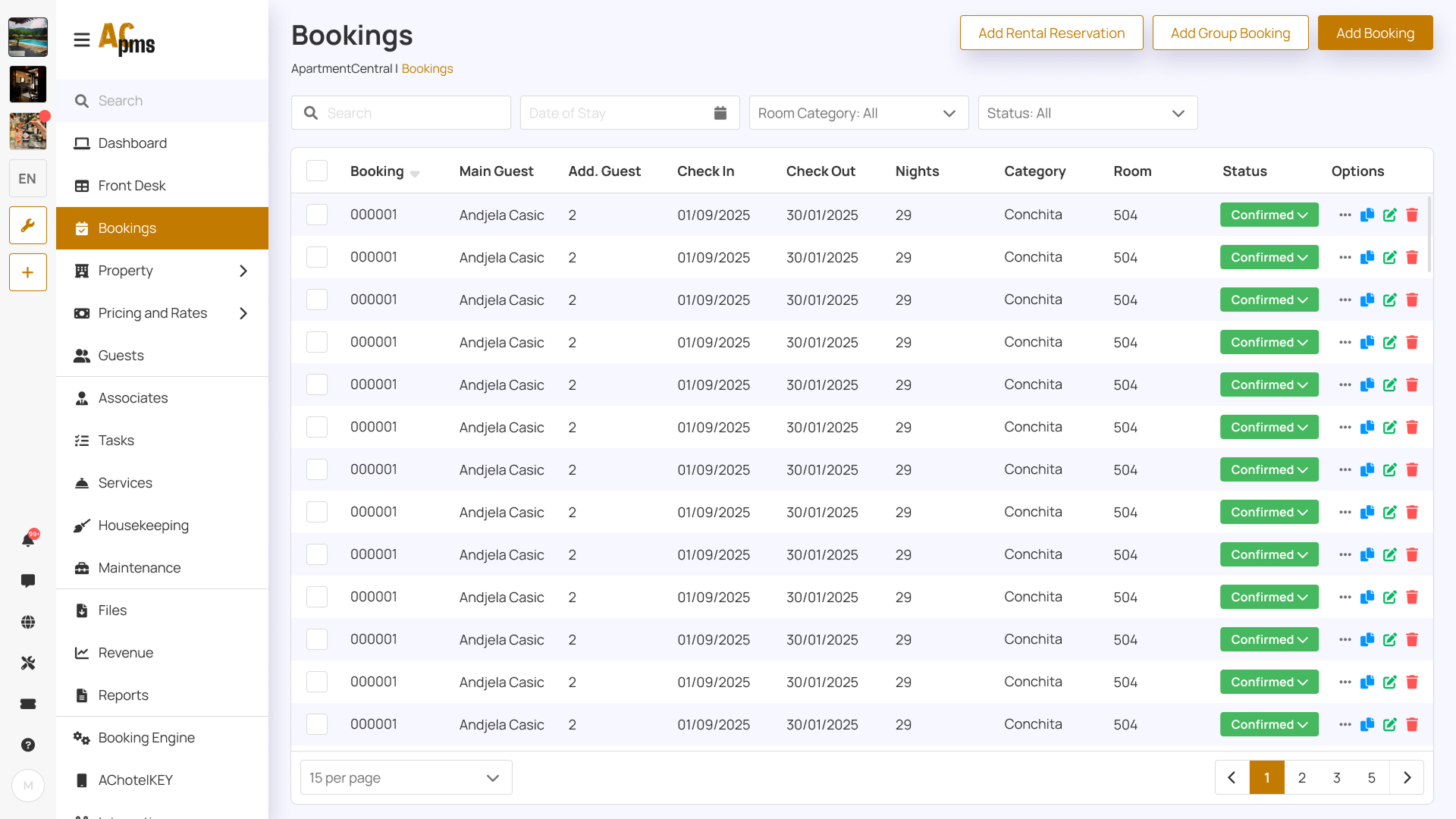
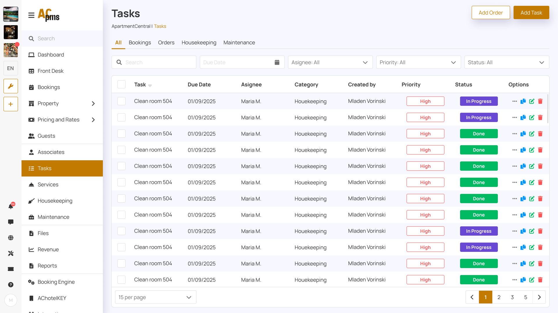
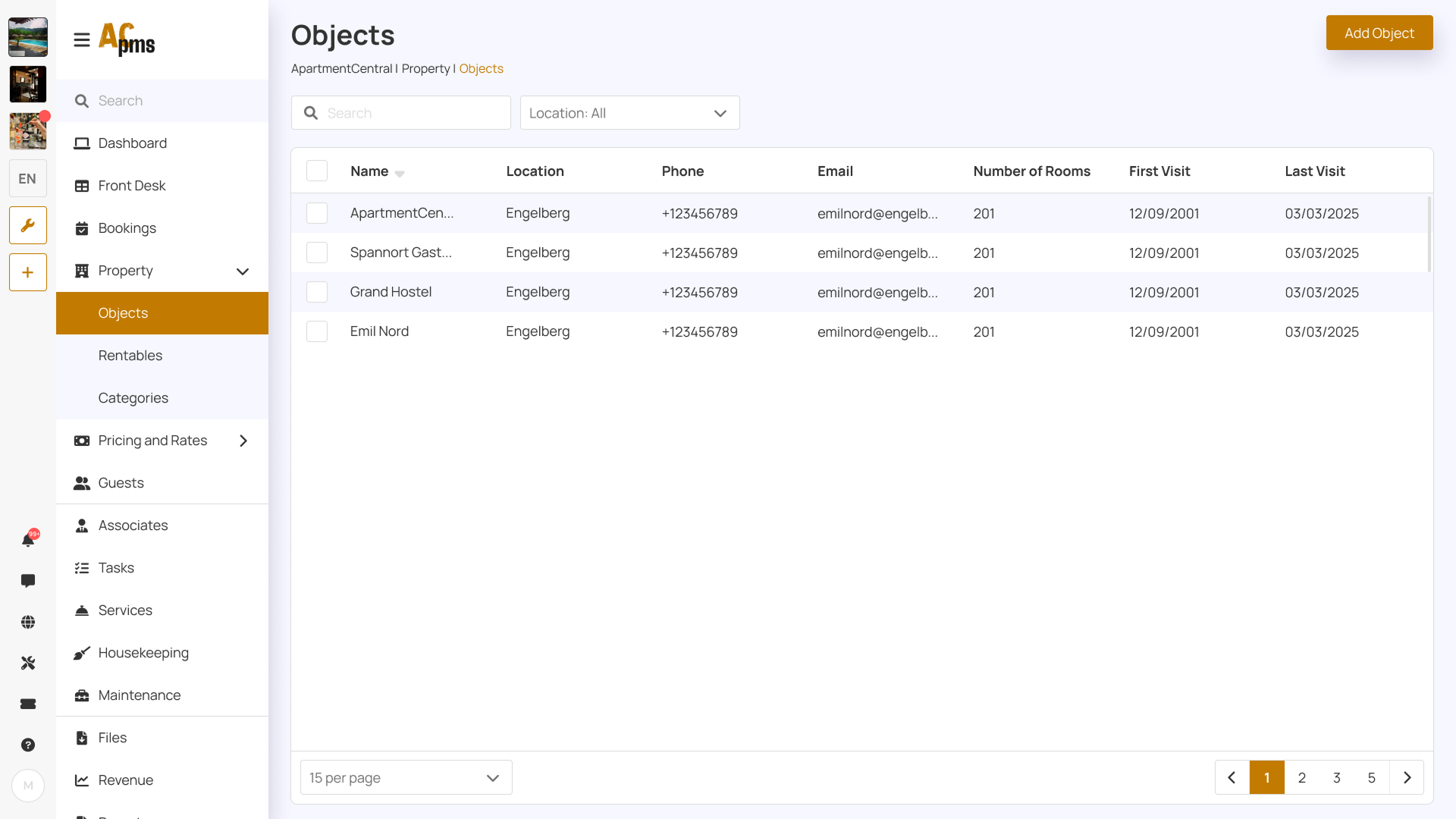
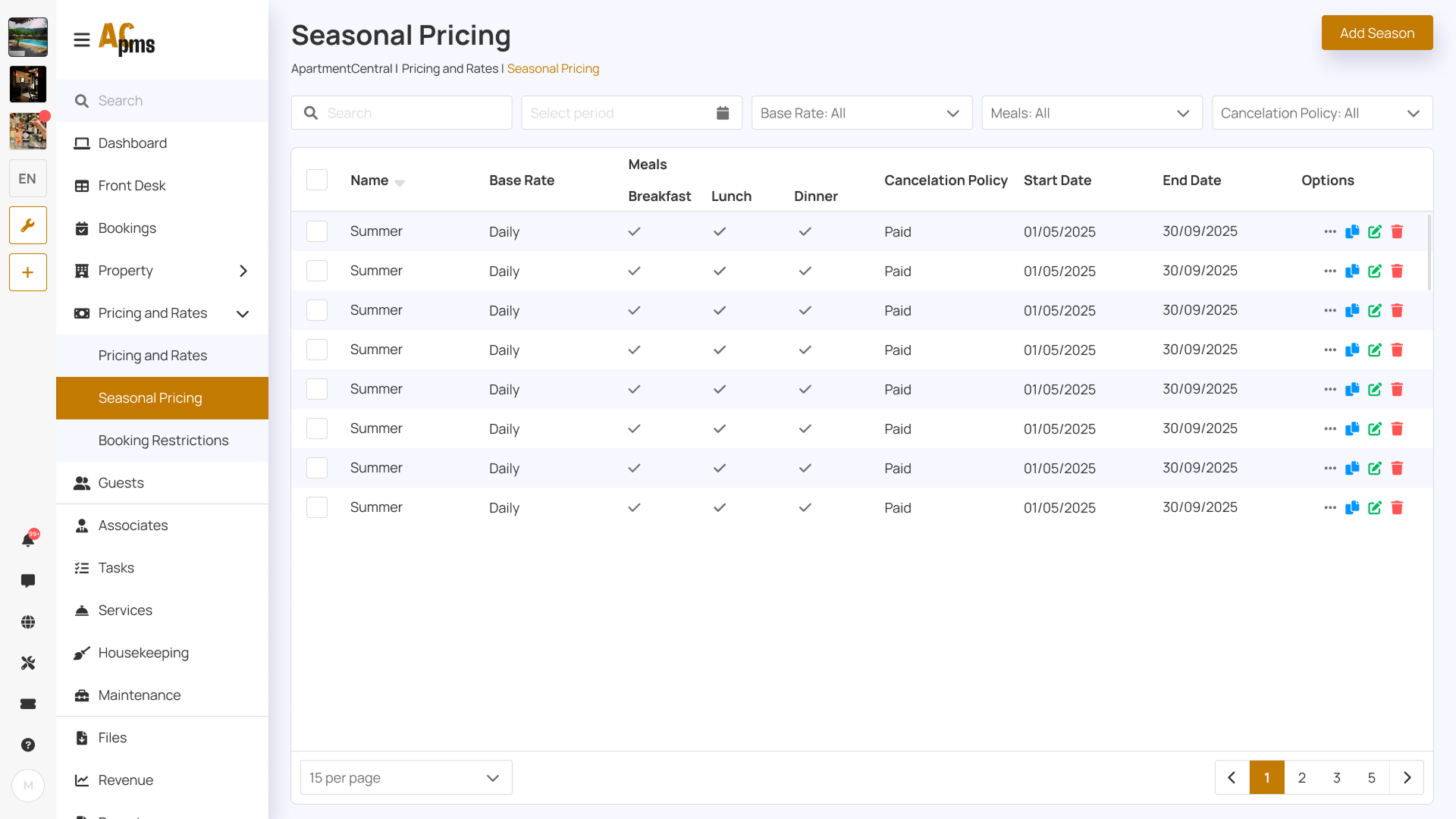
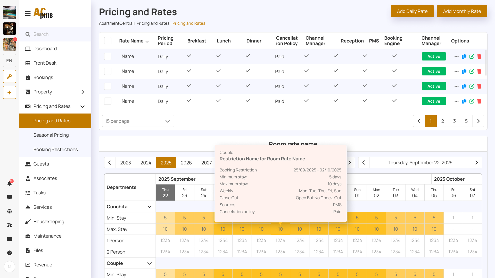
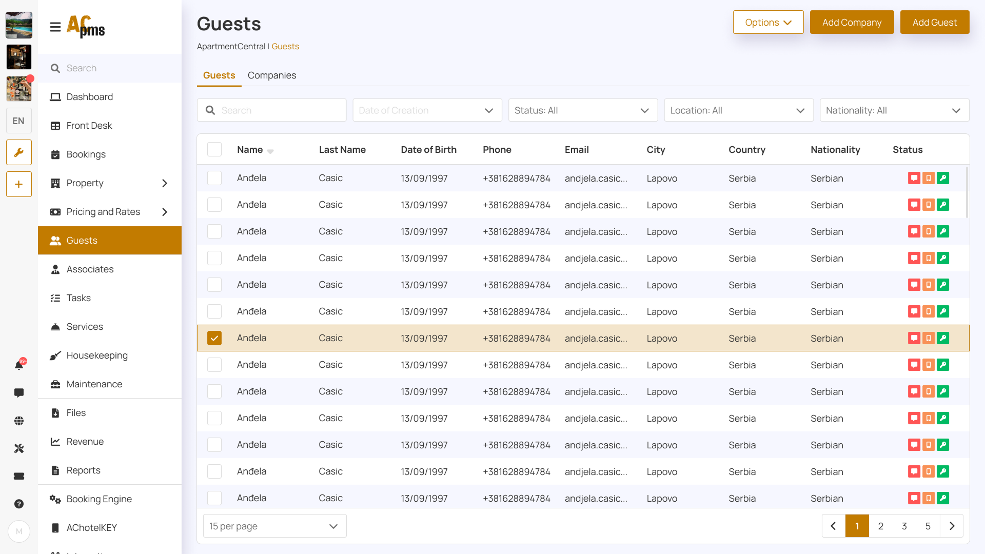
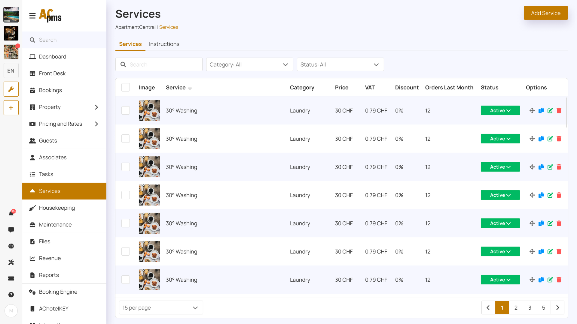
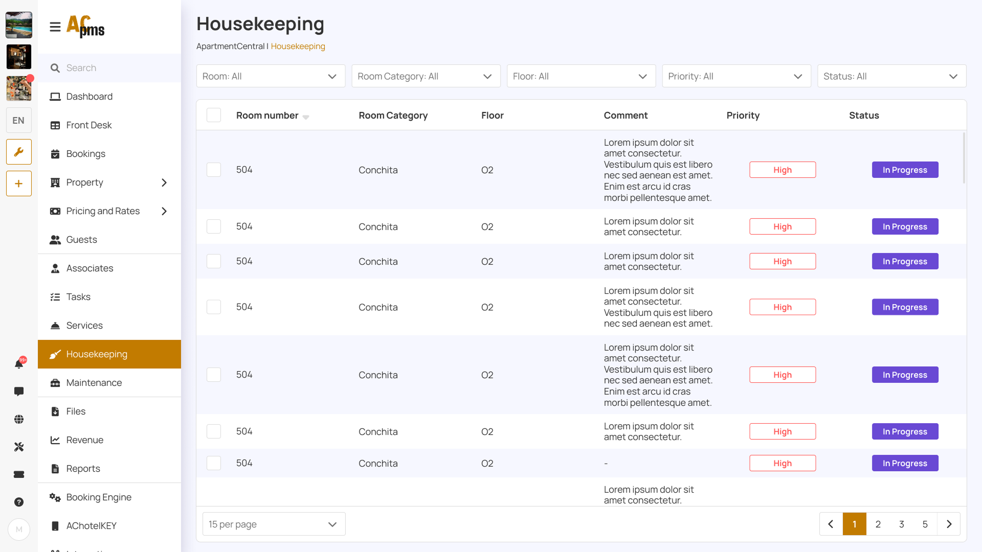
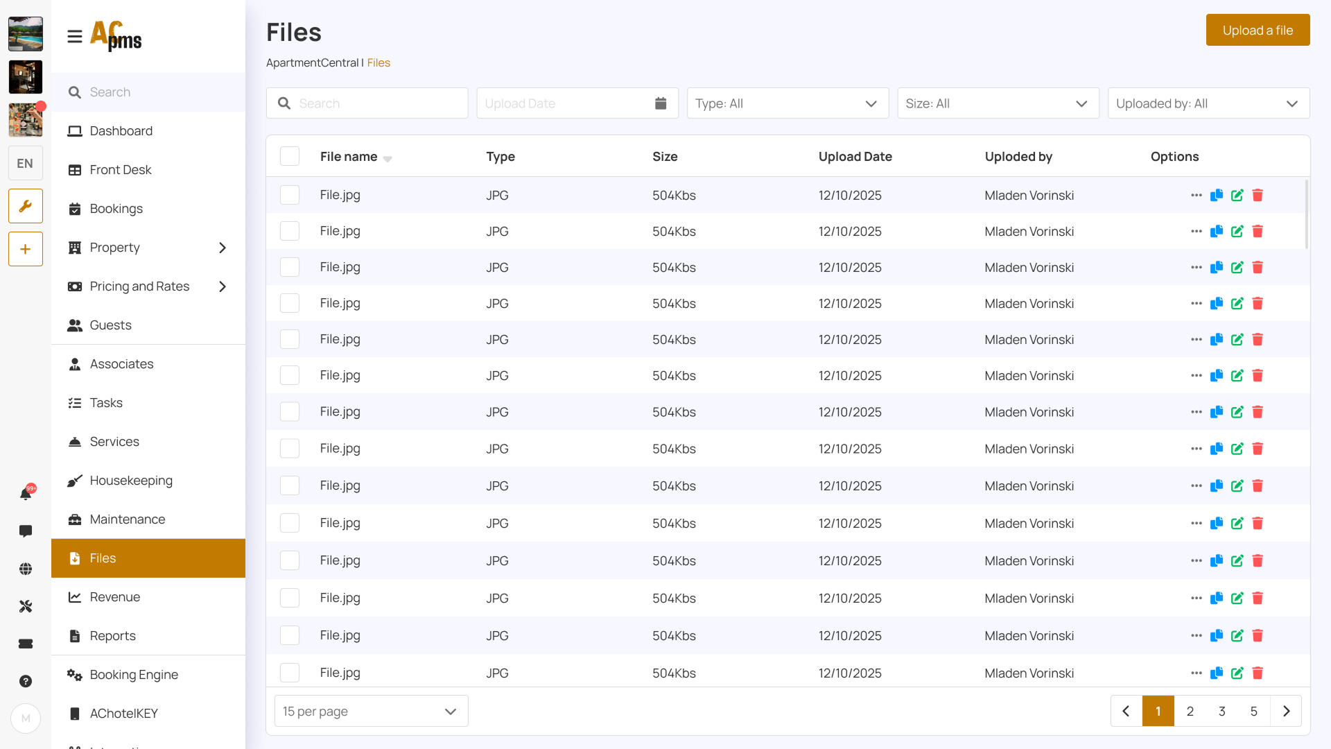
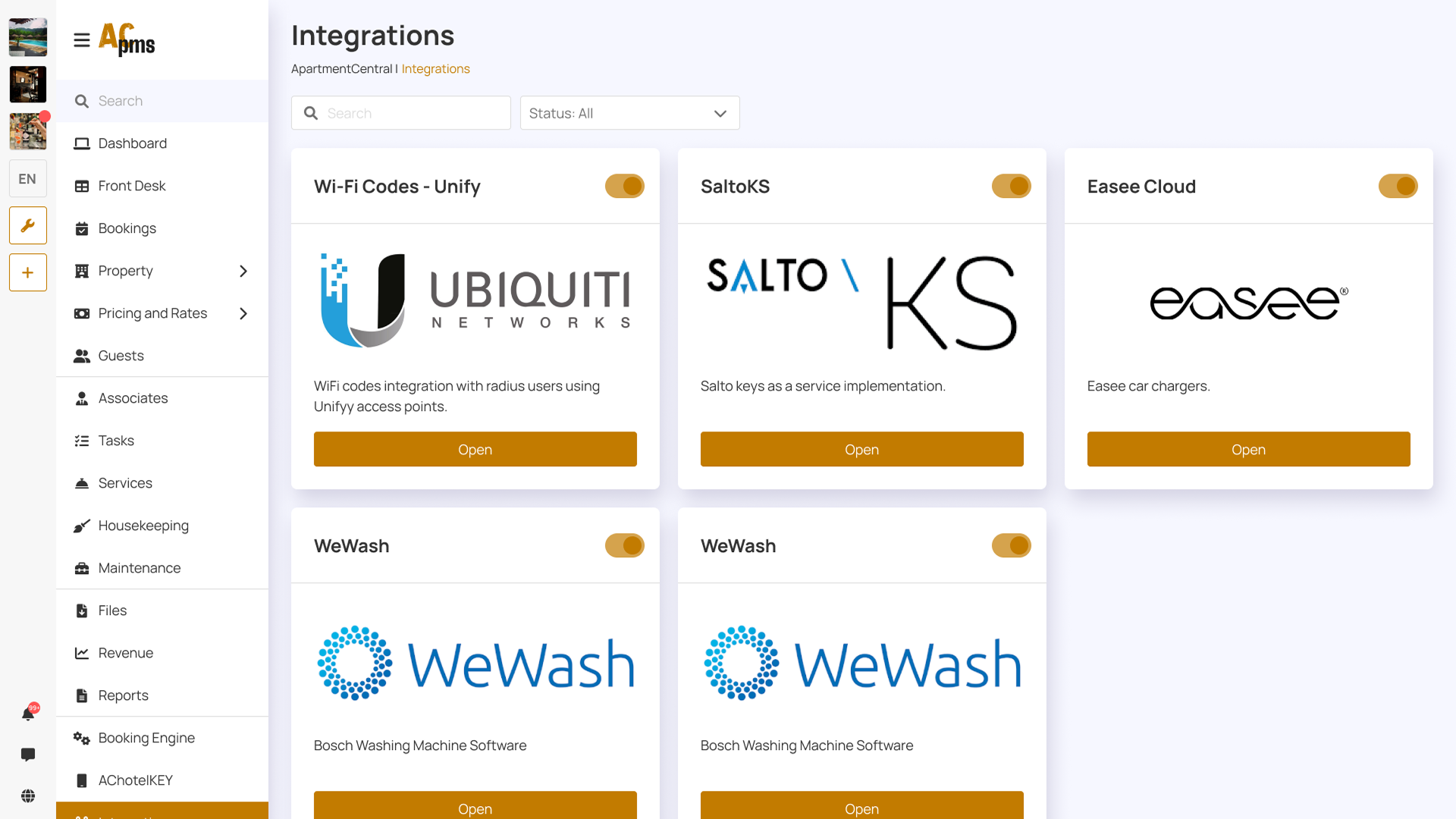
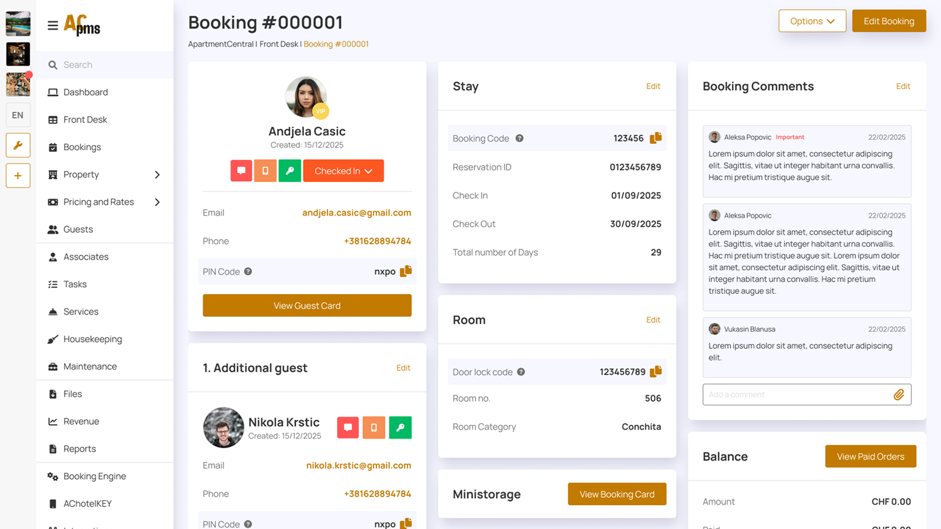
Key Screens
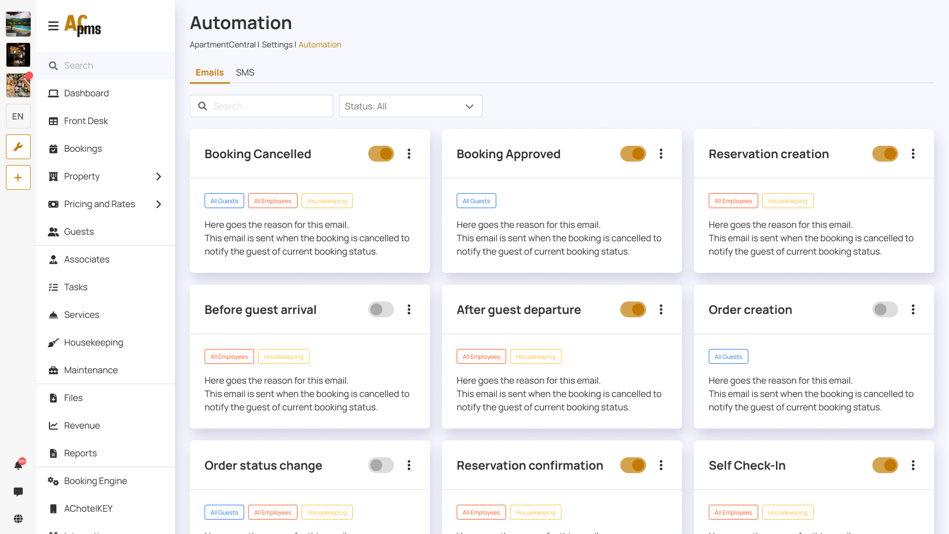
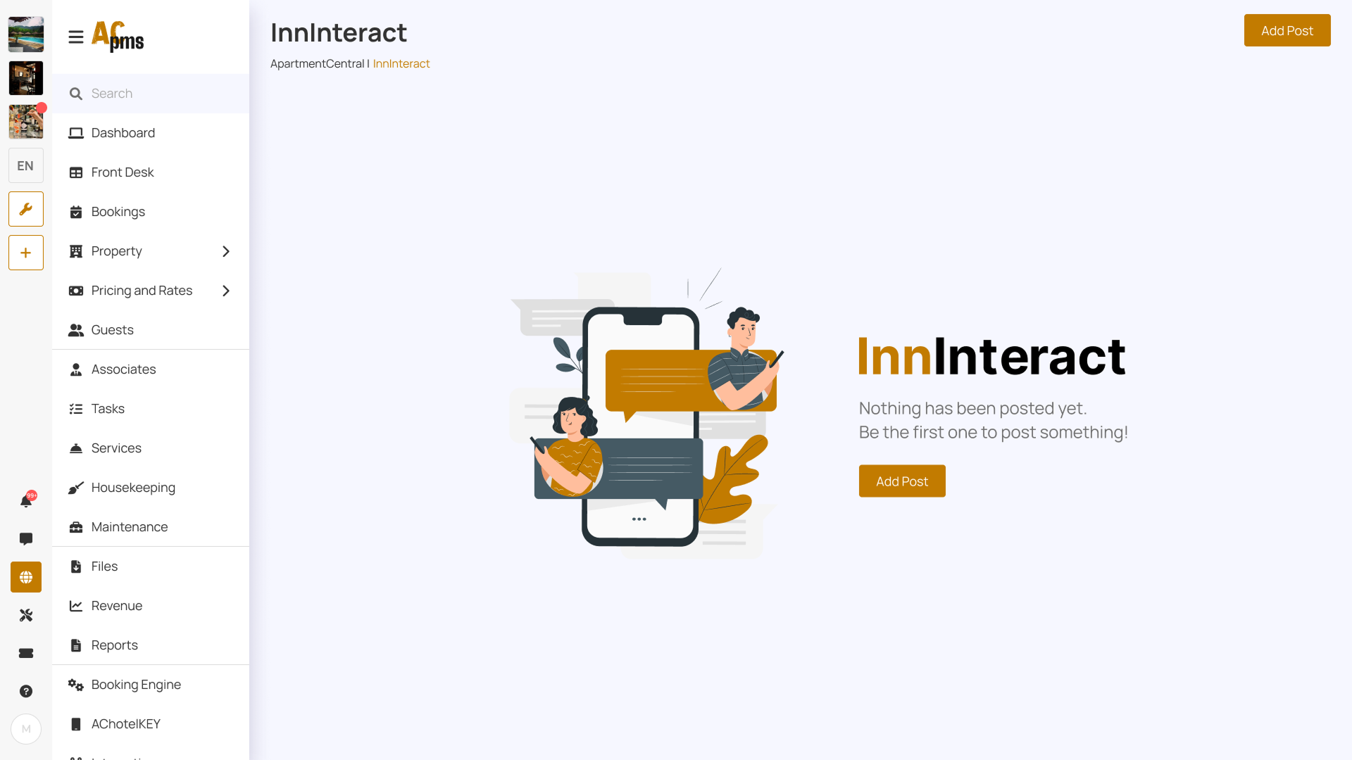
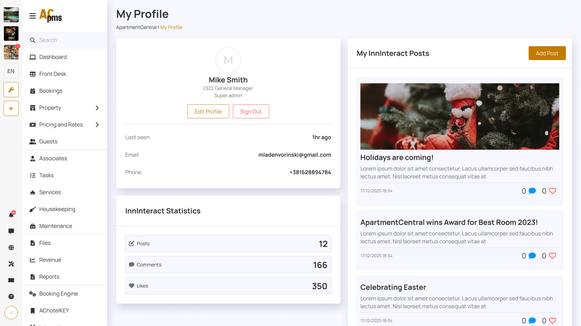
The final UI was designed for speed and clarity in a fast-paced hotel environment. The core screens include the Dashboard (agenda + alerts), Front Desk timeline, Bookings table with filters, and Guest Card with chat and lock controls. The system also supports AChotelKEY features like PIN/QR access, Wi-Fi setup, and self check-in/out — with clear feedback for edge cases such as failed unlock attempts, unpaid bills, and missed deliveries.
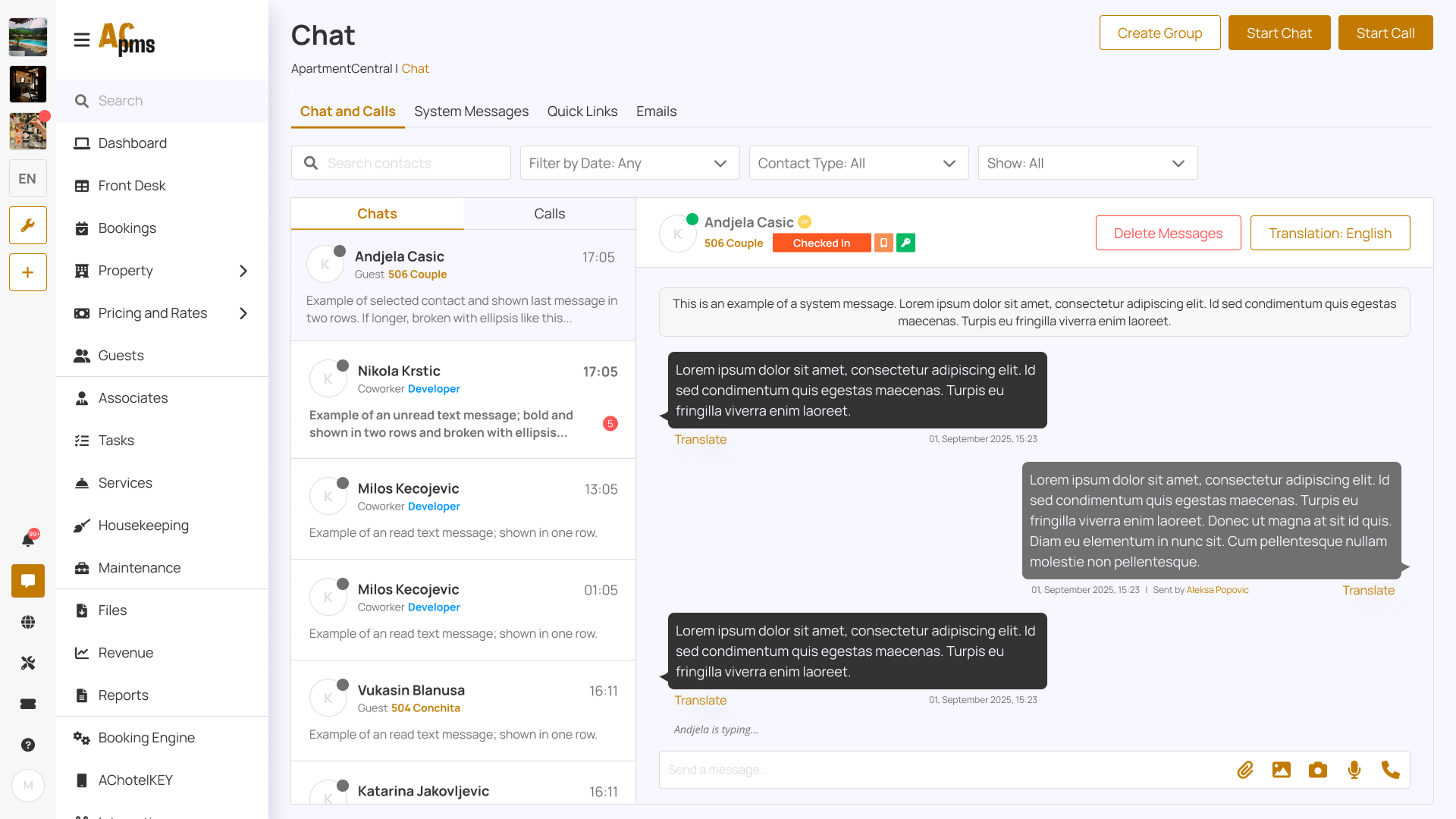
Interaction
The UI was designed with clear interaction patterns such as filtering, quick actions, and status-based decision making.

Accessibility & Responsiveness
Accessibility considerations
- High contrast for key text and important actions
- Clear status labels alongside color indicators
- Large clickable targets for high-frequency actions
- Structured layout that supports fast scanning
Responsiveness (planned/partial)
- Components designed to scale across common desktop breakpoints
- Cards and tables structured to avoid layout breaking on smaller screens
Expected Results
Expected outcomes
- Faster daily decision-making for front desk staff through dashboard prioritization
- Reduced time-on-task for booking search and guest management actions
- Fewer mistakes due to clear hierarchy, status indicators, and predictable UI patterns
- A scalable foundation for adding new features without UI inconsistency
Success metrics to track
- Average time to find a booking / guest card
- Time to complete check-in/check-out flow
- Number of support requests caused by unclear UI
- Task completion rates for common actions (unlock door, message guest, confirm booking)
What I Learned / Next Steps
What I learned
- Clear hierarchy matters more than "visual style" in operational tools
- Modular layouts make feature growth easier without redesigning whole pages
- Predictable patterns reduce errors in high-pressure environments
Next steps
- Validate key flows with 5 hotel staff members (front desk + housekeeping)
- Add more empty states and edge-case screens (no bookings, no guests, system offline)
- Improve filtering and bulk actions for large-scale properties