Case Study
BioStar — Organic Restaurant Website Rebrand
A visual refresh that clarifies the story, modernizes the brand, and guides visitors to reservations.
Overview
BioStar is an organic food restaurant. The goal of this redesign was to modernize the visual identity and improve the website structure so visitors can quickly understand the offering, explore the menu, and complete a reservation with confidence.
The Challenge
The previous website felt dated and cluttered, and it did not clearly communicate the brand story or guide visitors to key actions such as menu exploration and reservations.
Key challenges
- Unclear hierarchy made it hard to find menu, story, and contact details
- Visual inconsistency reduced trust in the brand
- Mobile readability needed improvement for on-the-go visitors
Goals
- Create a clean navigation structure and clearer content flow
- Showcase organic values, ingredients, and atmosphere
- Increase clarity for reservations and contact actions
- Deliver responsive layouts that remain readable across devices
User Flow & Structure
I reorganized the content structure around user intent: explore the menu, learn the story, and reserve a table. Navigation and page hierarchy were simplified to reduce cognitive load and improve findability.
Iterations
Early wireframes focused on readability, a clearer content flow, and strong placement for reservations and key information.
What I explored
- Homepage hierarchy that balances story, menu preview, and CTA
- Menu layout for scanning items and categories
- Team and story sections designed for credibility and warmth
Iteration improvements
- Stronger typography scale and spacing for content clarity
- More direct reservation placement across key screens
- Cleaner visual rhythm for long-scroll pages
UI Decisions
The visual system was designed to feel organic, modern, and premium while staying readable and conversion-friendly.
Design decisions
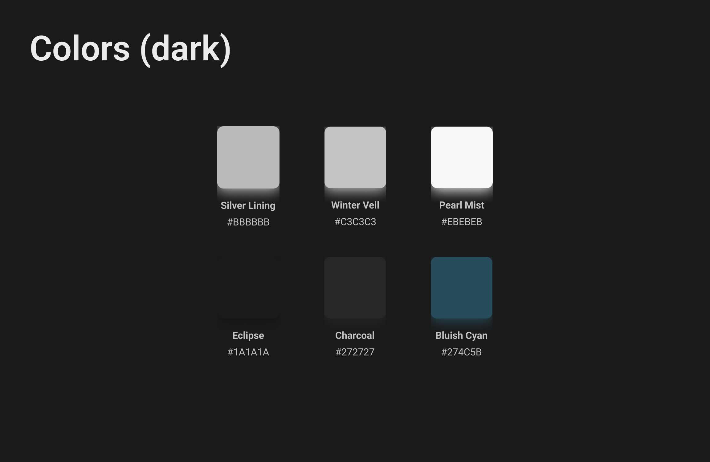
- Warm, natural palette with high-contrast text for readability
- Typography that supports both storytelling and scanning
- Consistent spacing and grid for a calm, premium layout
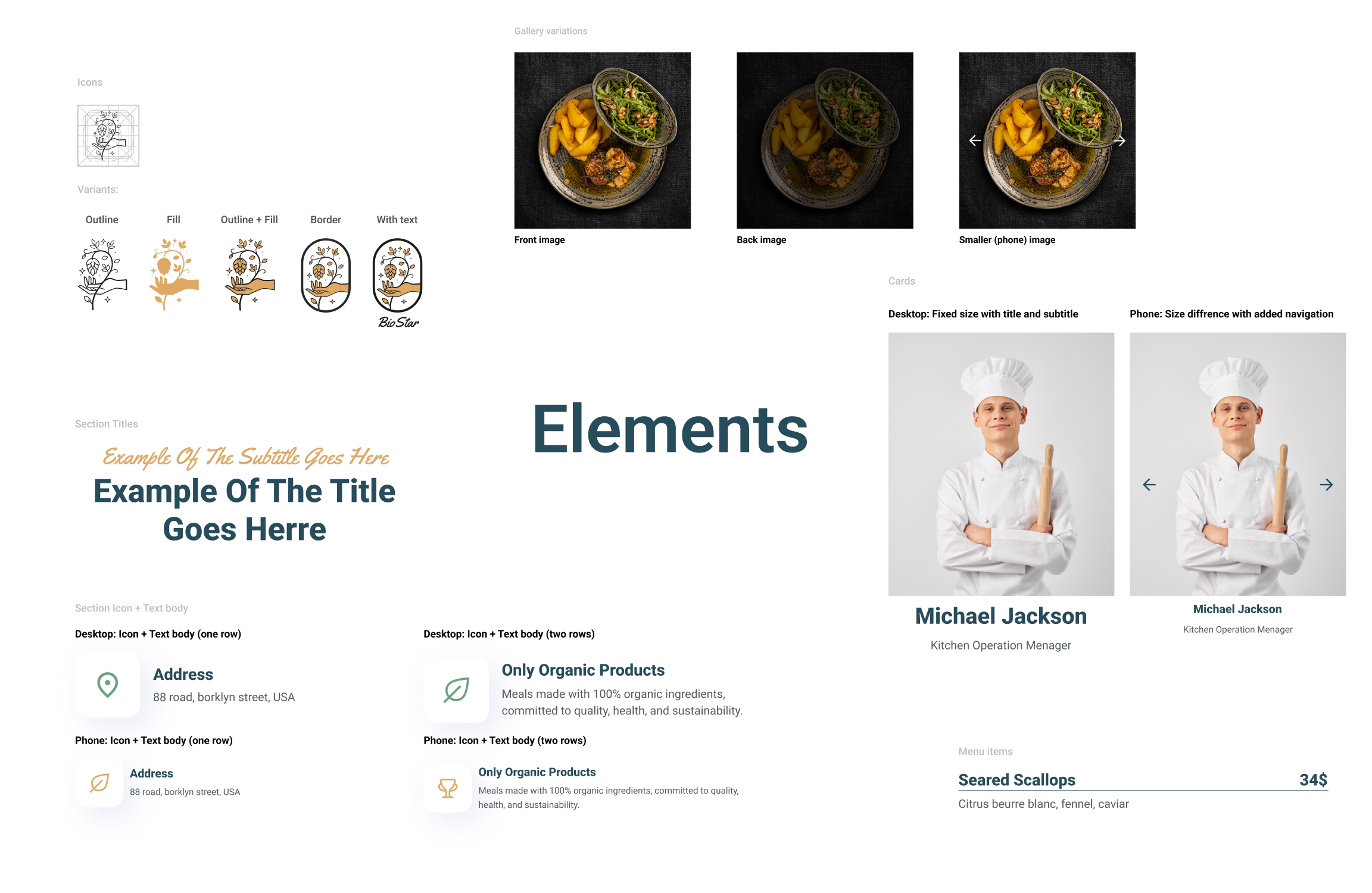
Components included
- Menu cards and category sections
- Image + text blocks for story/values
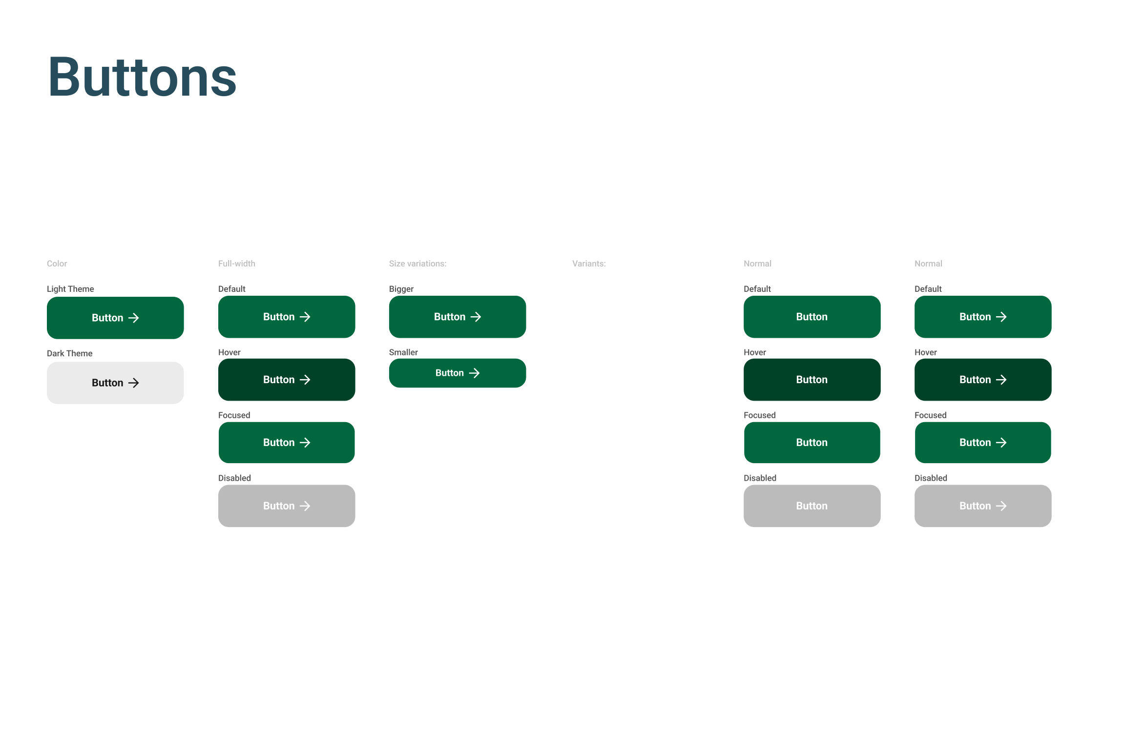
- Contact and reservation patterns
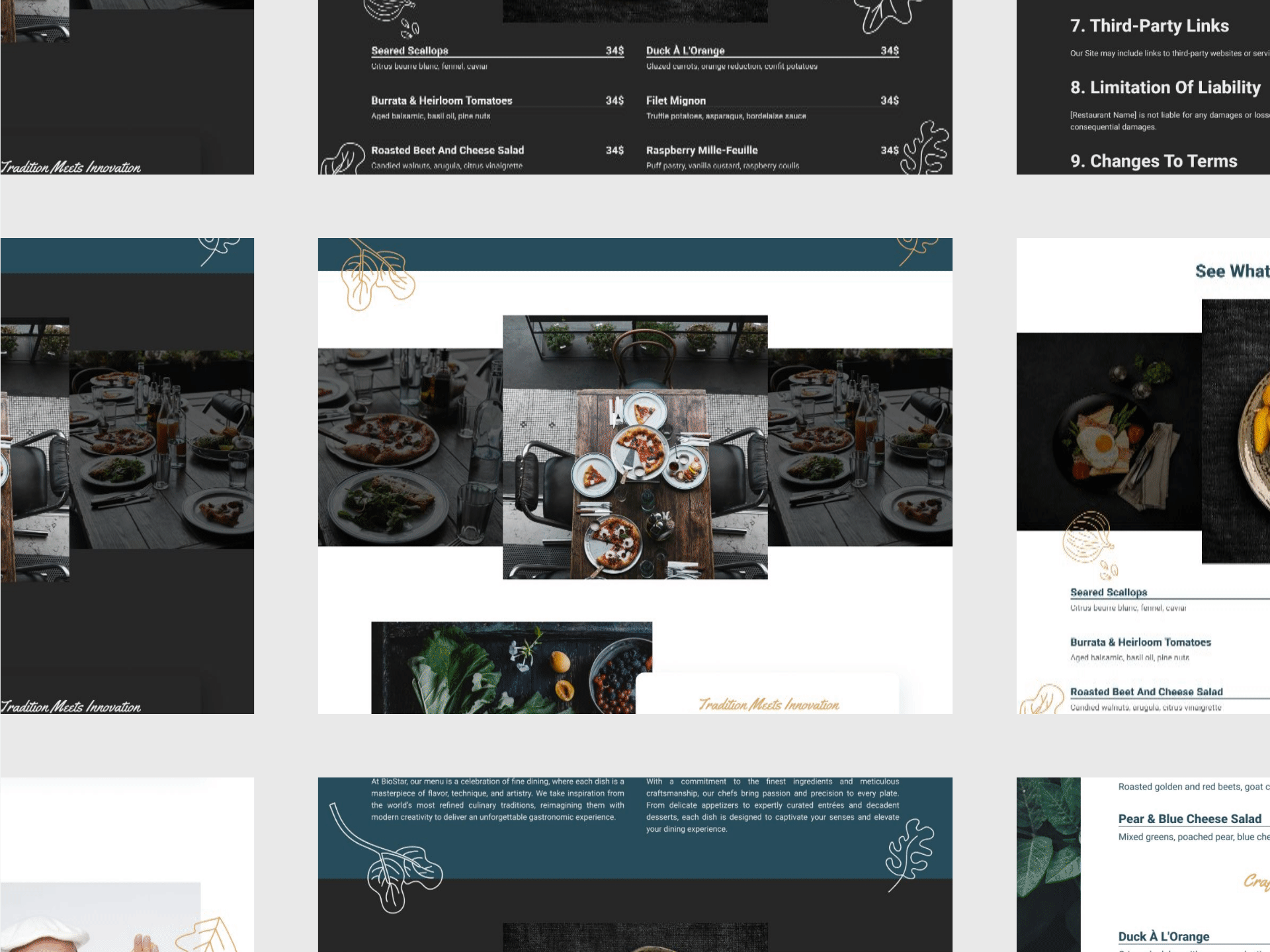
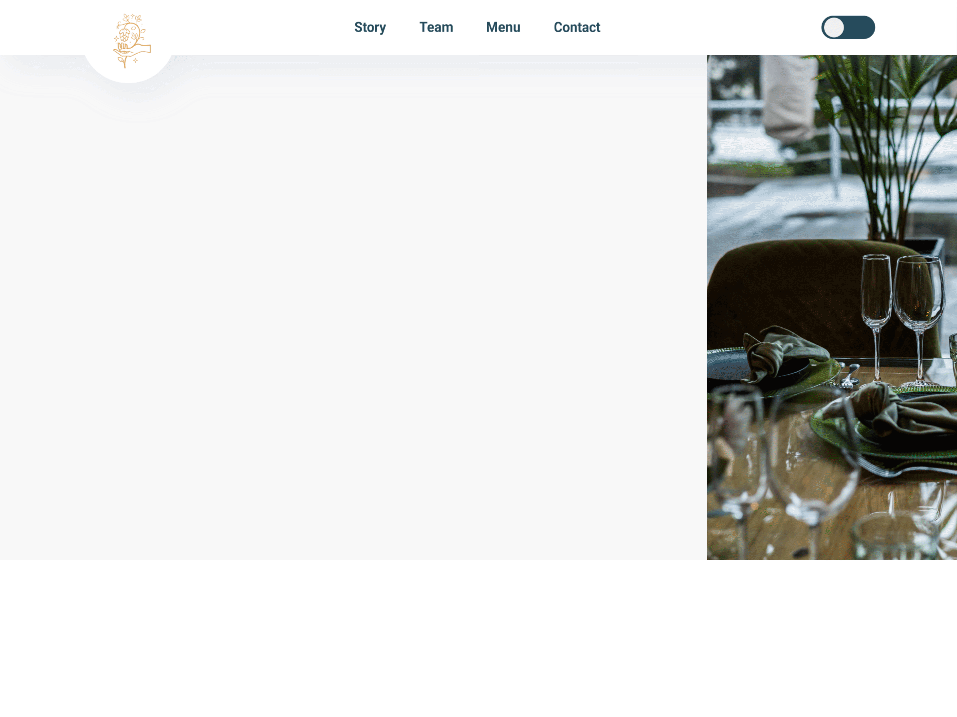
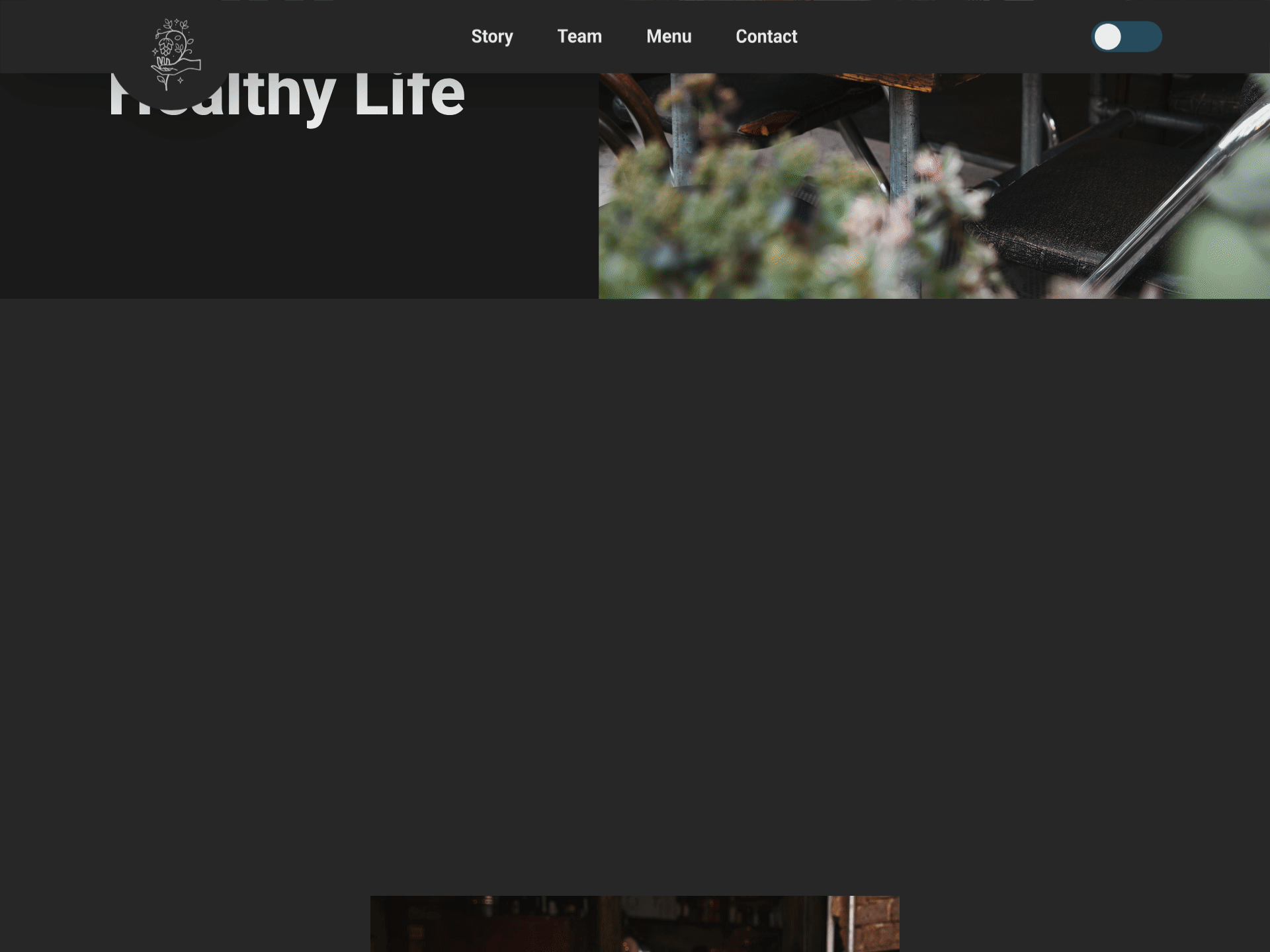
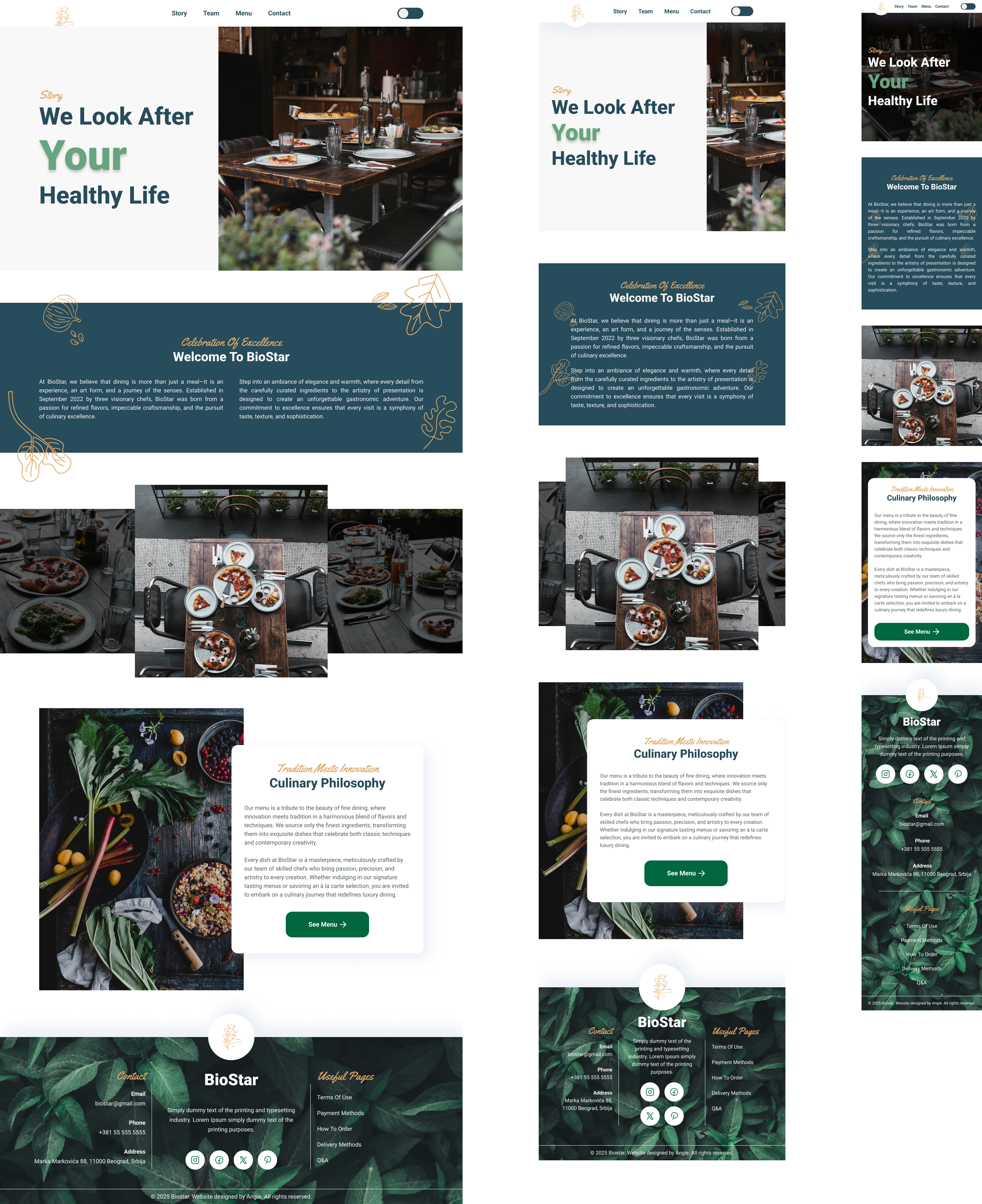
Key Screens
The final screens emphasize clear hierarchy and strong calls to action. Visitors can scan the menu, explore the story and team, and reach reservations or contact details quickly across desktop and mobile.
Interaction
The redesign focused on predictable patterns for navigation and clear CTAs. Prototype interactions were tested to ensure menu exploration and reservations feel smooth.
Accessibility & Responsiveness
Accessibility considerations
- Text contrast and readable type sizes across sections
- Consistent layout patterns for scanning
- Meaningful alt text and structured headings
Responsiveness
- Mobile-first readability for menu and reservation content
- Flexible grids and media that scale down without breaking layout
Expected Results
Expected outcomes
- More completed reservations through clearer CTAs
- Lower bounce rate through improved hierarchy and trust
- Faster menu exploration on mobile
- Consistent brand perception across screens
Success metrics to track
- Reservation click-through rate and completions
- Time on page and scroll depth on menu pages
- Mobile bounce rate
- Clicks to contact/location info (maps, phone)
What I Learned / Next Steps
What I learned
- For brand sites, clarity of hierarchy is conversion
- Strong CTA placement matters more than adding more content
- Consistency across screens builds trust quickly
Next steps
- Finalize copy and photography for launch
- Usability review with target visitors
- Hand-off with a small component guide for implementation